
The little touches around beer brands aren’t the first thing you notice. They come to bear over time. Too often, what gets talked about is just the dimensions of the beer itself – the aroma, the taste, the mouthfeel – or the brewing process; the brewer, the kit, the setup. But I like the details.
 Bottle embossing: more cost; more delight. Here the lovely twist of the River Thames around the base of a London Pride bottleMy past was a world of Big Beer. It’s a world of ‘cost optimisation’. It’s a world where, for the most part, the joy of beer is slowly being sucked away. The details which make a difference over time cannot be justified against ‘return on investment’ criteria, nor often can you do the maths anyway. In the war of attrition the details get eaten away. In time, even the people employed to steward the brands over the long term have to give way to the arguements of cost in the here and now. Have you noticed for example how lager bottles are getting lighter? Bud bottles used to be a deep brown. Hold an empty bottle now it’s no darker than a Ray Ban lens. The rationale: resource protection (Save the planet!). The real benefit: lower cost. How bottle neck foil has disappeared over time? Not scratched off by the thumbnail of the drinker (who always prefer it) but scratched from the product cost by the accountant’s relentless push for cost reduction? And have you noticed how beer labels are thinner and smaller? Or how cans, once you pour them crinkle like tin foil?

Other changes are less visible but more pernicious – like taking the ‘oxygen scavengers’ out of bottle crowns that protect the beer freshness but cost half a penny more; or making the card of your multipack thinner so it’s cheaper but as a shopper less stable to carry and more dangerous when taking it down off the shelf.
Thing is, there comes a point where the drinkers notice. Take Stella Artois: it is now available in a 284ml bottle – to allow them to hit attractive price points I assume. But whoever heard of a Belgian lager in a British Imperial bottle size? And who cares that it’s 284ml – why not make it 275ml like the others and damn the torpedoes? All I care about is that it’s not 330ml like it used to be and poor value as a result. Drinkers do notice beautiful labels like Sierra Nevada or Kernel. Drinkers do notice beautiful, embossed bottles like London Pride. Drinkers do notice quality materials like the labels and foils on the Thornbridge range.
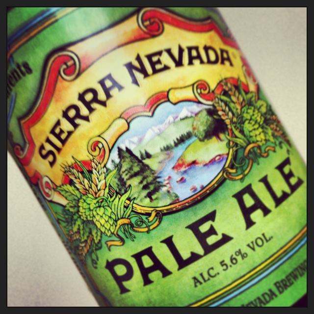 The Sierra Nevada label – like a map you can read it differently every time, seeing some new detail.We should celebrate the details. We should cherish the beers from the brewers who recognise that drinking beer is more than just drinking beer, but an experience that pleases all the senses and recognise that sometimes, despite what our financial advisers might suggest, you can’t put a price on it.
© Beer Tinted Spectacles, 2013
